
 + Mistakes to Avoid & Expert Tips")
Building a new healthcare website?
Modernizing an outdated one?
Your website isn’t just a digital brochure—it’s a powerful tool for attracting new patients, growing your practice, and positioning yourself as a trusted healthcare provider.
But what actually makes a great healthcare website?
To find out, I manually reviewed 1,192 healthcare websites—and I uncovered what works, what doesn’t, and what you should avoid.
In this post, you'll discover:
✅ The best healthcare website designs (with real examples)
✅ Common mistakes that might be hurting your site
✅ Expert healthcare web design tips to make your site more effective
Let’s dive in ...
Best healthcare website design examples
Need ideas for what a good healthcare website should look like? A picture is worth 1,000 words. Here are 16 fantastic examples to model ...

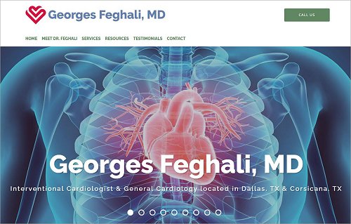
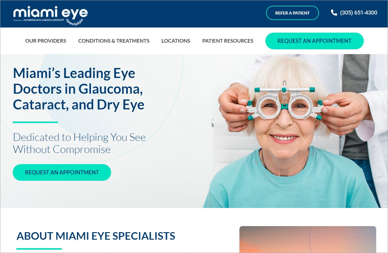
What I like:

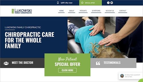
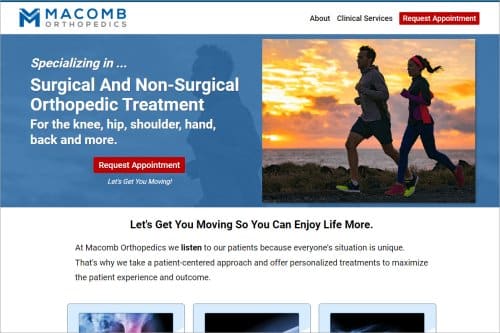
What I like:
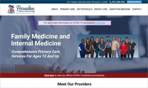
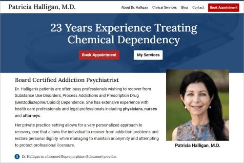
What I like:
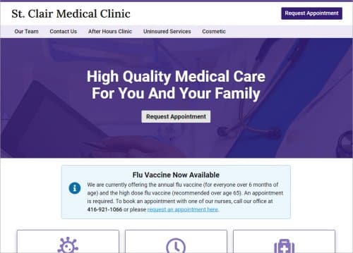
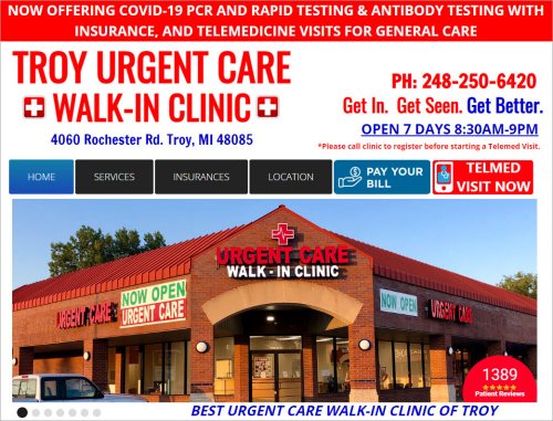
What I like:

What I like:

What I like:

What I like:
What I like:
What I like:
What I like:
What I like:

What I like:

What I like:
What I like:
What I like:

What I like:
Healthcare website design mistakes to avoid
Here are 13 mistakes that will absolutely tank the effectiveness of your healthcare website:
Now let's shift gears and look at how to make a great medical website.
Healthcare website design: Expert tips & best practices
I've been building high-quality, professional business websites for 20+ years. Here are my top 7 tips for building a great healthcare website:
TRUE STORY
How a bad medical website can cost you new patients

Mark Brinker
A few years ago I had a weird pea-sized growth on my ear.
I called a doctor friend of mine and asked what type of healthcare specialist I should see to get this thing checked out. He said, “An ENT (Ear, Nose Throat) specialist.”
I asked my friend if he knew a good ENT specialist he could refer me to. Yes, but I'd have to look him up online because my friend didn't have his phone number handy.
I Googled the ENT specialist and found his website alright — it looked like it was built by a 6th grader!
Even though this physician was recommended by a trusted friend, I couldn’t bring myself to make an appointment because his website was so bad.
Instead of instilling trust and confidence, this doctor’s website scared me away.
Getting new patients is hard enough. Don't make it even more difficult with a lousy website.
Note: My medical journey ended well. I called another doctor friend of mine and he connected me with a different ENT specialist ... with a respectable website. I made an appointment, had the weird growth removed from my ear (which was benign) and I’m all good.
Medical website design services & costs
How much does it cost to design and develop a medical website?
The cost to build (or redesign) a medical website is the same as for building any business website. For a detailed cost breakdown or to get a price estimate to build (or redesign) your website, click here.
The cost to build (or redesign) a medical website is the same as for building any business website. To get a detailed cost breakdown for creating a professional, high-quality medical website, click here.
Conclusion
A prospective patient's first interaction with you is usually via your website.
While looks at important, hopefully I've demonstrated that it takes more than a pretty website to attract patients.
Today it's no longer sufficient just to be good at what you do — you have to show patients you're the right healthcare professional that can help them.
Great Content. I am a Pharmacy Student interested in website design and development in the Healthcare Niche. All I need from you is guidance and a clear roadmap. I really appreciate any help you can provide.
I started developing web pages early 1990s. Am shocked at how awful web sites are slapped together these days. Scrolling fields without options to type manually type. Date fields are all over the place. Put the example using background text or for crying out loud automatically put in the dashes for the user! Auto caps for names! Examples embedded but don’t require the user to delete the examples! The list i have goes on and on. And they are all involve simple code. And why aren’t pages TESTED across multiple platforms. Ridiculous to me. I’m glad you have taken the time to review web pages.
Mark,
Thanks for your expert advice with real-world examples!
If I (and I think) many others visit sub-standard websites, we assume the business is also sub-standard and move onto another provider. If I visit an ABOVE-STANDARD website, optimized for customers, I assume the business is customer-centric, up to date, and high-class, the kind of business I want to partner with.
If they don’t put “their best foot forward”, I wonder what their “other foot” looks like…and go elsewhere!
Hi Mark,
Great article. The reason why many medical websites don’t have testimonials is that they are actually not allowed to. For example in Australia, the Australian Health Practioner Regulation Agency states that doctor websites can’t have testimonials. See this link for more info:
https://www.ahpra.gov.au/Publications/Advertising-resources/Legislation-guidelines/Summary-of-advertising-obligations.aspx
Thanks, Adam, for letting us know that patient testimonials are not allowed in Australia. Good to know. Here in the USA, patient testimonials generally are permitted as long as they’re not false or misleading. But some states are more restrictive than others regarding the use of patient testimonials. As always, when in doubt, consult with your attorney.
They’re illegal in Texas as well. See https://www.texmed.org/Template.aspx?id=2092
Thank you very much for sharing. We greatly appreciate it.