
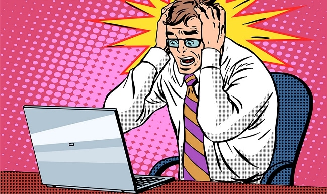
Here’s a sad scenario.
Someone sends a prospective client your way. They’re a warm, maybe even a hot lead.
Before contacting you, they do what everyone else does — they visit your website to check you out.
Then nothing. They don’t call for an appointment. No email inquiry. Nothing. Just crickets.
What happened?
Your poorly designed website scared them away.
Instead of giving them confidence and establishing trust, your site did just the opposite. It created doubt, uncertainty and a general feeling of uneasiness about you and your company.
They click the “back button” on their browser and go somewhere else — probably to one of your competitors with inferior services to yours, but with a better website.
What Makes A Good Website?
Rather than just give you my personal opinion, I scoured the internet and compiled data on this topic from a variety of reputable sources. Here’s your Executive Summary:
* * * * * *
10 Scientifically-Backed Ways to Increase Sales by Making Your Website More Credible by Jayson DeMers.
Key takeaways:
- Prominently display your address and phone number + make it easy for people to contact you via email or contact form.
- Have your website professionally-designed. It shouldn’t look like it was built by a 6th grader.
- Provide a good user experience when they visit your site. Make sure your content is organized and easy to navigate. Get rid of superfluous content and other distractions that don’t contribute to your overall message.
- Display testimonials from actual customers, with their pictures if available.
- Keep your site’s content up to date. Visitors also want to see content that is current and relevant
- Profile the people behind your company. People do business with other people. Prospective clients want to know who they’ll be dealing with. Tell your story. Let people get to know you.
- Make sure your content is free of typos and errors. Nothing screams amateur like misspelled words and grammatical errors.
(Source: Forbes.com)
* * * * * *
Just Say No: 7 Website Design Mistakes That Can Hurt Conversion by Maricel Rivera.
Key takeaways:
- 75% of consumers admit that they judge a business’ credibility based on their website design.
- Poor website loading speed can be extremely harmful to businesses. Most consumers expect a web page to load in 2 seconds or less. 79% of shoppers reported that they would not return to purchase from a slow loading website.
- Websites must be mobile-friendly and optimized to adapt to various interfaces. According to comScore, the number of users accessing content online through their mobile devices has surpassed those who use a desktop.
- Website clutter is a a huge deterrent. Ex: Too many Flash animations, ad prompts, auto-play videos, background music, etc.
- Once again, site navigation is a factor that hurts conversion. Confused, frustrated prospects don’t buy.
- A missing or confusing call-to-action. You must let your visitor know what you want them to do next. Don’t assume they’ll know. Be direct and specific. Gently nudge them where you want them to go.
(Source: Business.com)
* * * * * *
10 Small Business Website Errors That Drive Customers Away by Brad Shorr.
Key takeaways:
- Quickly explain what’s in it for them. Avoid droning on about endless features, benefits or all your accolades. Prospective clients are interested in one thing, “Can you help me?”
- Make sure to use credibility elements such as customer testimonials, BBB and other well-known accreditations. Otherwise your visitors have only your marketing propaganda to go by.
- Your site must be mobile-friendly. As mentioned above, more people today access the Internet from mobile devices than from desktop computers.
- Creating user-friendly website navigation is far more complex and nuanced than meets the eye. Good navigation is intuitive and simple, and makes it easy for visitors to quickly find what they need.
- Eliminate fluff and weak language. “We’re the best,” “we’re the cheapest,” “we’re the most innovative,” tells your reader nothing. Provide details about why your company is different or what they can expect when they do business with you.
- Stay away from cringeworthy, cheesy stock photos that everyone uses. These make you look phony and amateurish. When possible, use your own custom images. It’s ok to use custom stock imagery if it’s professional and high-quality, but be prepared to dig a little bit to find the good stuff.
- As mentioned above, your site needs to be mobile-friendly. Mostly to provide a good user experience to your visitor, but also for search engine rankings. In April 2015, Google publicly stated that it’ll give preference in the search listings to web pages that are mobile-friendly vs. those that are not.
(Source: Forbes.com)
What Different Consumer Groups Really Want from Local Business Websites by Myles Anderson.
Myles Anderson surveyed 800 people in all age groups. Here’s what he discovered:
- The 4 pieces of website info most likely to influence a consumer to use that business are: (1) Details about the business (e.g., company origins, products, services, people), (2) Business proximity, (3) Clear address and contact details and (4) Customer testimonials.
- The 4 biggest negatives for a local website are: (1) Poor quality content, (2) No phone number displayed, (3) No prices displayed and (4) The business not being local enough.
- Most consumers of all ages prefer to contact local businesses by phone after viewing their website.
(Source: SearchEngineLand.com)
* * * * * *
Want To See Some Examples Of Good Websites?
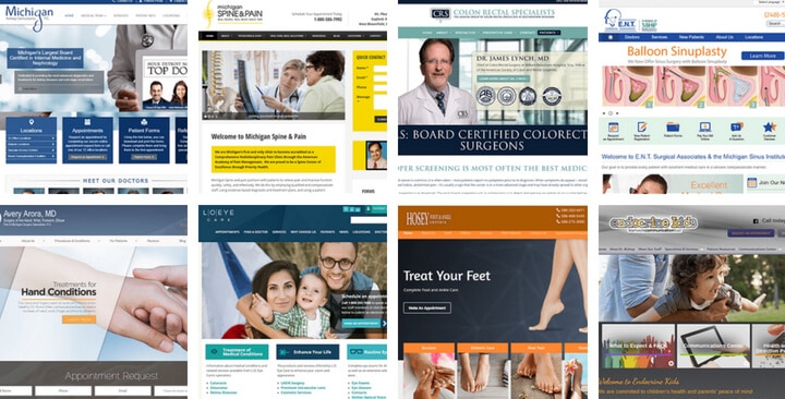
Rather than just telling you what makes up a good website, let me show you some real-life examples of sites that are getting it right.
Recently I analyzed over 1,000 websites in the medical industry and compiled a report summarizing what I found. It doesn’t matter if you’re not in the medical industry because the findings are universal and apply to all websites.
My article is titled, “I Analyzed 1,100 Medical Websites And Here’s What I Learned” and you can check it out here.
Great article, very informative. So much so that I referenced and cited you in one of my blogpost! I love great content like this, keep it coming ! I also would love to become an affiliate for you if that opportunity still exists.
KC.
Thanks, Mark. The website has a serious effect on our business. If the website design and content is bad, it will damage your business. On the other hand, if it looks like an authority website, then your business is on a money roll.
Good article. I see way too many companies with websites that look like they were built in 1998. It makes me skeptical about how serious they are about they’re business model.